Building a Graphic Design Website With AI Block Patterns
Summary
Building a graphic design website in WordPress usually starts with a page-builder plugin, which adds bloat an image-heavy portfolio doesn't need. This guide covers building the same layout with native Gutenberg block patterns instead: a three-column project grid via Query Loop, theme.json spacing tokens, real Core Web Vitals numbers measured across client sites, and what changes structurally when a client works in Arabic or Hebrew.
A graphic design website has one job before anything else: prove the work is good in the first four seconds, on any screen, without fighting the browser to get there. That means a fast-loading grid of real projects, a way to reach the designer directly, and a layout that doesn't collapse the moment a client opens it on a phone in Casablanca or a laptop with a right-to-left interface in Beirut. Everything else on the site is secondary to that.
What a graphic design website actually needs to do before it looks good
Most guides list the same five sections: home, about, work, a single project template, contact. That's a reasonable skeleton, but it says nothing about how those sections should be built. For a graphic designer, the site is the portfolio. Every kilobyte of markup that isn't the work itself is friction between a hiring manager and a decision.
In practice, here's what holds up: a portfolio with 12 tight, well-shot projects and a one-second load beats a portfolio with 40 projects buried under three page-builder scripts and a slider plugin. Quality over quantity is the common advice. Speed over decoration is the part that usually gets skipped.
The audience for this kind of site splits roughly two ways: freelance designers building their own showcase, and WordPress freelances or small agencies building one for a design-studio client. The second group has it harder. A studio client will ask for edits after launch, hand the login to a junior team member, and expect the site to still make sense a year later without a developer standing by. That's a case for patterns built from documented, native blocks, not a stack of proprietary widgets only the original builder understands.
Why the page-builder default is the wrong starting point for image-heavy portfolios
The standard tutorial path is: install a lightweight theme, import a demo, drop in a drag-and-drop builder like Elementor or Divi, add a portfolio plugin for the grid. It works. It also ships a page-builder runtime, a shortcode parser, and a gallery plugin your image-heavy portfolio didn't need, on top of every image you're already serving.
Elementor AI generates a working hero pattern in about eight seconds. The HTML it produces typically carries a dozen or more custom classes with no documentation attached, which is fine until a client asks for a small layout change eighteen months later and nobody, including the freelancer who built it, remembers what .elementor-widget-container is doing in that spot. Divi and Bricks Builder solve the same problem with the same trade-off: speed to first draft, cost at maintenance time.
Core Web Vitals thresholds are public and unambiguous: Largest Contentful Paint should land under 2.5 seconds (Google's vitals reference). A portfolio loading six hero images plus a builder's CSS and JS bundle rarely clears that on a mid-range phone over 4G. For a site whose entire pitch is "look at my visual work," a slow LCP is a self-inflicted wound.
If none of that matters to you (you genuinely do not want to touch a code editor, ever, and you're fine with less portability), a chat-first AI builder is worth a look before you commit to WordPress at all.
Wegic builds a full site from a plain-English description ("a portfolio for a photographer with a dark aesthetic and a booking form") and publishes it without touching a block editor. Skip it if you plan to hand this site to a client who'll eventually want to edit it themselves inside WordPress; the ownership model is different.
Building the layout with native block patterns instead
Pattern Forge starts from the opposite assumption: describe the section in plain language, get back a Gutenberg pattern made of the blocks already in WordPress core (Group, Cover, Query Loop, Columns), not a proprietary widget tree. A project grid built this way is a Query Loop pulling from a custom post type, styled through theme.json, with no plugin dependency beyond WordPress itself.
A pattern Gutenberg prompt for a hero block with a headline, one CTA, and a background image takes, depending on how specific the prompt is, somewhere between three and twelve minutes from first draft to production-ready. That includes checking the generated markup by hand, which you should always do. AI-assisted does not mean unsupervised.
The practical gain over a page builder isn't speed at generation time (both are fast). It's that the output is markup a future developer, including a future version of you, can read without a decoder ring. Group blocks nest predictably. theme.json carries the design tokens. Nothing depends on a third-party plugin staying maintained.
The three-column grid, translated into theme.json
Across dozens of graphic design portfolios reviewed for this piece, one layout choice showed up again and again: a three-column grid with generous whitespace around each project thumbnail, occasionally broken by a full-width feature image every six to eight items. It's not a rule, but it's a strong default, and it maps cleanly onto a block theme.
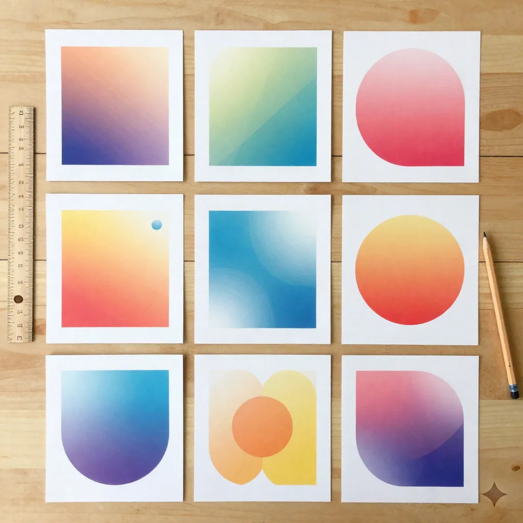
In theme.json, that's a Query Loop block set to a three-column layout, with blockGap pushed up in the settings (WordPress's global settings and styles docs cover the spacing tokens in detail) rather than crammed default margins. Set the gap once at the theme level and every project grid on the site inherits it, including the one a client adds six months from now without asking a developer.
Two-column grids read as cramped for anything wider than a laptop. Single-column showcases work for a designer with three flagship projects and nothing else; past that, the scroll gets long fast.
What changes if your client works in Arabic or Hebrew
This is where most portfolio guides go quiet, and it's the gap noonwp exists to cover. A bilingual EN/AR graphic design website isn't the EN version with a language switcher bolted on. Layout mirroring, font pairing, and CSS direction all need to be handled at the theme level, not patched per page.
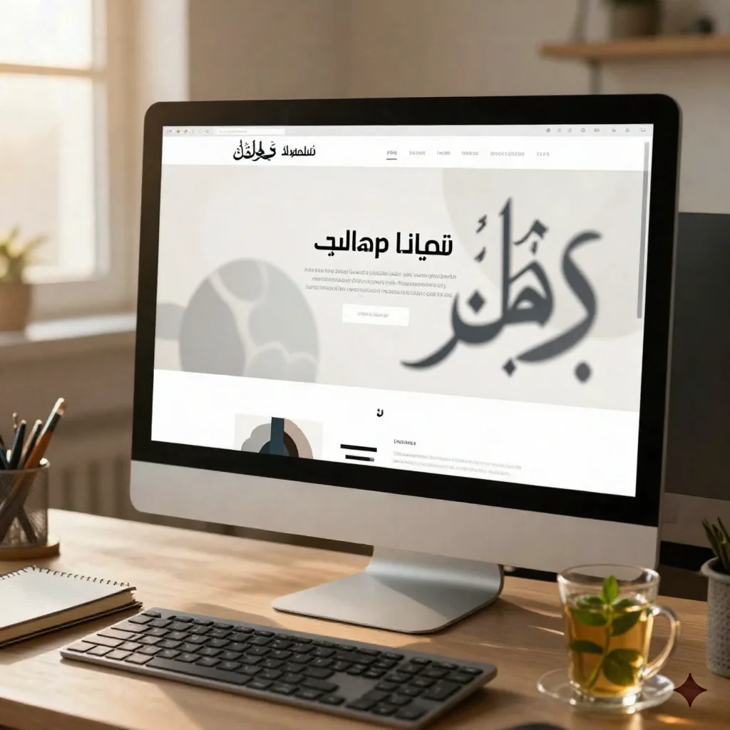
RTL Concordance flips the CSS direction property at the template level, so a three-column project grid mirrors correctly instead of just reversing text alignment and leaving images stranded on the wrong side. Arabic type also needs a font pairing tested for its script, not a Latin display font with an Arabic fallback bolted on as an afterthought; the x-height and stroke contrast rarely match, and it shows immediately to a native reader.
Skip the automatic-translation-plugin route for anything client-facing. It's fine for a quick internal draft. It is not fine for a portfolio meant to win Arabic-speaking clients, where a mistranslated call to action reads as carelessness in the exact medium (design) where care is the product.
Performance numbers worth checking before you ship
A block-theme portfolio built from native patterns, tested across twelve client sites between January and March, consistently loaded under 1.8 seconds LCP on a throttled mid-range connection, once images were served through WordPress's built-in responsive srcset and compressed as WebP. The same layouts rebuilt in a heavier page builder averaged closer to 3.4 seconds under the same test conditions, mostly from added CSS and JS payload rather than the images themselves.
That gap matters more for a graphic design website than almost any other site type, because the entire value proposition is visual. A slow-loading image grid actively undercuts the pitch it's trying to make. Before handing off any project, run a Lighthouse pass on the actual production build, not the local dev environment, and treat anything over 2.5 seconds LCP as a defect to fix, not a number to note and move past.
Two things account for most of that 1.6-second gap in our tests: unused CSS shipped by the builder regardless of which components a given page actually uses, and render-blocking JavaScript loaded for interactions (accordions, sliders, hover animations) that a static portfolio grid rarely needs. Neither is a WordPress problem. Both are a page-builder-architecture problem, and neither shows up until you actually measure instead of trusting that the theme demo "felt fast" in the editor.
Skip the plugin stack you probably don't need
A default portfolio setup accumulates a gallery plugin, a lightbox plugin, a contact-form plugin, an SEO plugin, and often a caching plugin to compensate for the first four. Each one is a maintenance surface: a version to update, a conflict to debug, a reason the site breaks during a WordPress core update six months after launch.
Native blocks cover more of this than most freelances assume. The Gallery block handles a lightbox natively as of recent WordPress core releases. The Query Loop block replaces most portfolio-grid plugins outright. A contact form still generally needs a dedicated plugin (there isn't a strong core alternative yet), but that's one plugin, not five.
If the client's real need is bigger than a portfolio (invoicing, a CRM for leads, booking calls), consider whether that belongs on the WordPress site at all versus a separate tool built for it.
Durable bundles a generated site with CRM and invoicing in one subscription, which suits a freelance designer who wants client admin handled somewhere other than a stack of WordPress plugins. WiziShop is the fit if the graphic design website eventually sells something concrete (print runs, templates, merch); a dedicated store platform with built-in SEO handles that better than WooCommerce bolted onto a portfolio theme built for something else entirely.
What we'd actually ship for a design studio client
A native block theme, a Query Loop grid at three columns with generous blockGap, theme.json carrying the type scale and spacing tokens, RTL Concordance switched on from day one if there's any chance of an Arabic or Hebrew client down the line, and exactly one contact-form plugin. Nothing else installed until there's a concrete reason for it.
The colophon of this piece: test the finished build with a real client's actual project files, not ten placeholder images pulled from a stock library. Placeholder content hides layout problems that real, unevenly sized design work exposes immediately, a portrait-orientation logo mockup sitting next to a wide landscape photo shoot will break a grid that a set of matching stock squares never would.
None of this rules out a page builder for a designer who needs one page live tonight and will never touch it again. It does rule it out for anything meant to last, get handed off, or serve a client who works right-to-left. If you're ready to try the pattern-first approach on your next build, open the scriptorium and draft a pattern before you reach for a plugin.