AI Website Design: Five Gates Before a Client Sees It
Summary
AI website design gives you a believable homepage in minutes, but the flaws a screenshot hides (low contrast, scattered hardcoded styles, layouts that break in right-to-left) surface after launch. Use five gates: write a half-page brief, ask for directions rather than pages, pin the chosen palette and scales to theme.json, rebuild the structure in native blocks, then audit contrast, headings, keyboard order and RTL before handoff.

AI website design now produces a plausible homepage in about the time it takes to pour a coffee. That speed is real, and it is also the trap. A generated page looks finished long before it is, and the unfinished parts (contrast, heading order, mirrored layouts, token discipline) are exactly the parts a client discovers three weeks after launch. What follows is the sequence we use to keep the speed and drop the surprises: five gates, in order, each with a clear pass or fail.
Why does a generated site look done when it is not?
Because the model optimises for what a screenshot shows. Hero, three feature cards, a testimonial row, a footer. Every one of those pieces is statistically familiar, so the whole page reads as professional at a glance. The things a screenshot cannot show are the things that decide whether the site survives a client handoff.
Take accessibility. The WebAIM Million 2026 report found detected WCAG 2 failures on 95.9% of the top million home pages, and low contrast text on 83.9% of them. A model trained on that web reproduces that web. It will hand you a pale grey caption on a cream background with complete confidence.
The second invisible problem is where the design decisions live. A generated page tends to carry its colours, sizes and spacing as literal values scattered through the markup. Change the brand blue next quarter and you are hunting through forty blocks. That is a maintenance bill, and the freelancer pays it, not the model.
So the useful question is not "can AI design this site?" It can produce a draft. The useful question is "which decisions do I let it make, and where do I check its work?" The five gates answer that.
Gate one: write the brief before you open the tool
Most disappointing AI output traces back to a one-line prompt. "A website for a bakery in Casablanca" gives the model permission to invent everything: audience, tone, page list, calls to action. It will invent them from the average of every bakery site it has seen.
A brief that works fits on half a page. Who visits, and what they came to do in the first ten seconds. The three pages that must exist. The one action the site is for (book, call, order). Two sites the client admires and one they hate. The languages, including direction: if the site ships in Arabic or Hebrew, say so now, not after the layout is approved.
That last line matters more than it looks. Right-to-left is a layout property, not a translation task, and a model told nothing about it will produce a left-aligned design with Arabic pasted in. Putting direction in the brief changes which layouts the tool proposes. It costs one sentence.
Skip the "make it modern and clean" adjectives. They carry no information. "Dense and editorial, like a newspaper section front" carries plenty.
Gate two: ask for directions, never for pages
The cheapest use of AI in this whole job is exploration. Ask for three to five distinct directions as rough layouts and type pairings, then choose before anything is built. Six sketches cost a few minutes. Rebuilding a page the client rejected costs an afternoon.
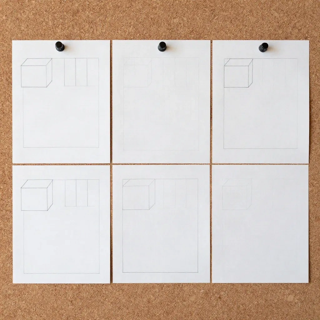
The discipline is to keep them cheap. Do not let the tool render full pages with generated photography for each direction; clients fall in love with the photographs and then cannot separate the layout from the pictures. Grey boxes and real headings are enough. If the client cannot choose between three grey-box layouts, the brief was the problem, and you have learned that for free.
Tool category matters here, and it is worth being blunt about it. Full-site generators such as 10Web build a complete WordPress site from a prompt, a URL or a Figma file, with plans starting at $10/month billed annually for one site. Hosted builders such as Durable go from a few answers to a finished small-business site in roughly half a minute. Both are excellent at gate two and weak at gate four, because they own the design decisions rather than exposing them. Use them to see options. Be suspicious of using them as the final build on a site you will maintain for years.
Gate three: pin the design to theme.json before you build
This is the gate most workflows skip, and it is the one that separates a site you can maintain from a site you can only demo. Once a direction is chosen, extract its decisions into tokens and write them into theme.json: the colour palette, the font families and sizes, the spacing scale, the content width. From here on, every block references a token by slug, never a literal value.
The theme.json reference exists for exactly this purpose. It gives a block theme one place to declare the palette and scales that the editor then offers as controls. When the brand blue changes, you change one line. When a client opens the Site Editor, they pick from your palette instead of a free colour wheel, which quietly prevents a whole category of off-brand edits.
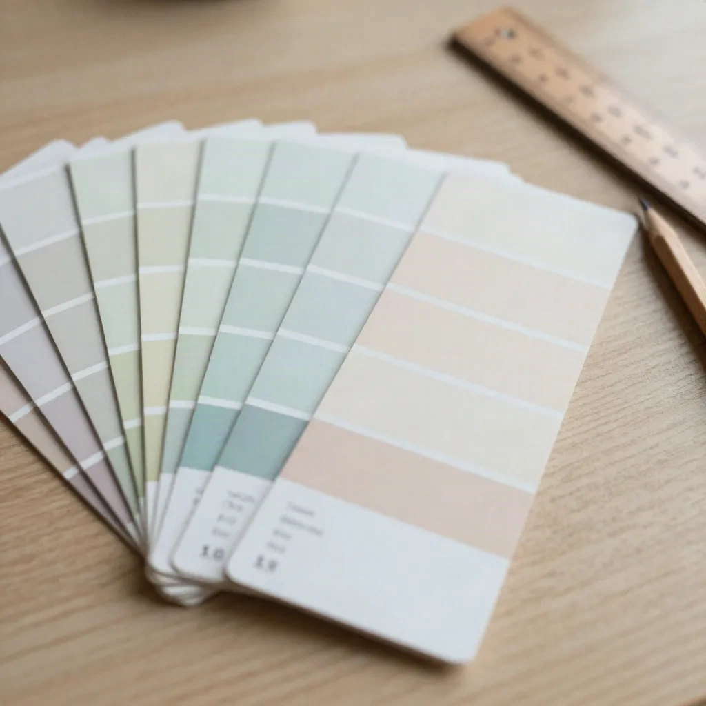
Here the AI earns its keep in a different way. Give it the chosen direction and ask for a token set, then check it against two rules. Every text and background pair must reach 4.5:1 for normal text (the WCAG AA threshold), so compute the ratios yourself rather than trusting the model's claim. And the scale must be small: five or six spacing steps, a type scale of six sizes. Models love to hand you fourteen near-identical greys. Delete eleven of them.
A practical test of whether this gate held: open the finished theme and search for a hex code in any template. If you find one, a decision escaped the system.
Gate four: build in native blocks and keep the generator out of the loop
Now build. The structure the model proposed is usually worth keeping: section order, column logic, the rhythm between dense and open areas. The markup it produced is usually not. Rebuild the approved structure in core blocks (Group, Columns, Cover, Query Loop) using your tokens, and treat the generated output as a reference drawing rather than a source file.
This sounds slower. In our experience it is faster by the second page, because native blocks inherit the tokens, respond to the Site Editor and behave when a client edits them. Generated markup that hardcodes its styling fights every one of those. Page builders sit at the other end of the same trade. Divi, rebuilt as Divi 5 in February 2026, ships Divi AI on its Pro tier at $277 a year, and the output stays inside Divi's module system. That is a legitimate choice for an agency standardised on Divi. It is a different product from a block theme, with a different exit cost, and you should price that exit cost into the quote.
Where AI generation still earns a place inside the build is the repetitive layer: a variation of a pricing section, placeholder copy shaped like the real thing, alternative hero arrangements for the client to compare. Treat each as a draft pattern to be tidied and registered, never as finished work.
One honest limit. If the project needs real interaction (filtered archives, custom query logic, anything with JavaScript behaviour), no generator will carry it. A developer writes that part, and the AI contribution stays at the edges.
Gate five: audit what a screenshot cannot show
Run the same short audit on every site, in the same order, so it becomes a habit rather than a mood.
First, contrast. Check the real rendered pairs, including text over images and the disabled and hover states the model never considered. Second, heading structure: one H1, headings that descend without skipping, and no heading chosen only because it is big. Third, keyboard: tab through the whole page and confirm focus is visible and the order follows the reading order. Fourth, alt text on every image that carries meaning, and empty alt on the ones that do not.
The fifth check is the one that sets noonwp apart from a generic checklist: direction. If the site has an Arabic or Hebrew version, view it in right-to-left and look for what did not mirror. Icons that point the wrong way, a hero image whose focal subject now sits against the text, padding written as margin-left instead of a logical property such as margin-inline-start. These are cheap to fix when you find them at this gate and embarrassing to find in a client's screenshot.
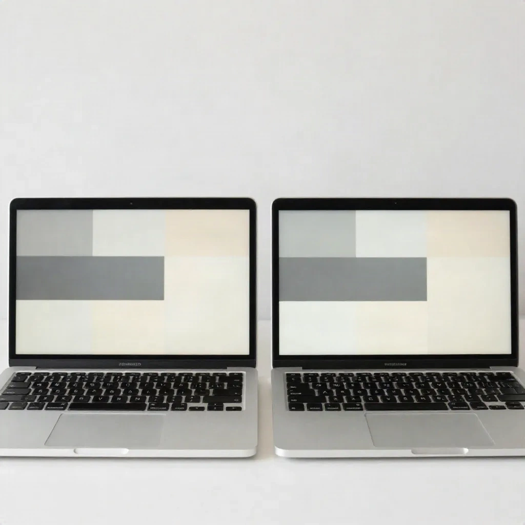
Keep the audit evidence. A before and after pair per page, a note of what failed, a note of what you changed. It turns "AI-assisted" from a vague claim into a deliverable, and it is the paragraph in your handoff document that justifies your fee against a client who tried a generator themselves last weekend.
What about the one-prompt site builders?
They have a place, and the place is narrow. A one-prompt builder is a fine way to produce a throwaway prototype for a pitch, a landing page for a weekend event, or a visual starting point for a client who cannot describe what they want. Framer pairs an AI site generator with a freeform canvas and a free tier, which makes it good for exactly that kind of fast, disposable visual work, and its Basic plan starts at $10 a month.
Skip them when the site must live on WordPress, be edited by a non-technical client, or serve a right-to-left audience, because you will be rebuilding the output in blocks anyway. The prototype was still worth having; the page was not worth shipping. Knowing which of those two you are holding saves the most time of all.
What to try on your next brief
Pick one live project and run only gates one and three. Write the half-page brief, then pin the chosen palette and scales into theme.json before a single page exists. Time it, and compare against how long your last site took to reach a stable design. If the result holds, add the other three gates one at a time. Which gate would have saved you the most pain on the last site you shipped?