AI Web Design in 2026: What It Saves and What It Breaks
Summary
AI web design means describing a page in plain language and getting layout, styling and copy back in minutes. It saves real time on blank-page work, repeated variations and copy scaffolding. It breaks on design tokens, accessibility and right-to-left layouts, where generated pages ignore theme.json and reproduce common web errors. Use AI to widen early options, build the approved structure in native blocks, and audit contrast, headings and keyboard order before any client handoff.
Ask ten designers what AI web design means and you get ten answers. For most people in this trade it means one thing: describing a page in plain language and getting a usable layout, copy and styling back in minutes, then spending an hour fixing what the machine guessed wrong. This folio looks at where AI web design genuinely saves time, where it quietly costs you more, and how to fit it into a WordPress block theme project without handing the client a mess.
What does AI web design actually cover in 2026?
The label hides four different jobs. Treating them as one is how teams end up disappointed.
Layout generation: a prompt becomes a wireframe or a full page structure.
Visual styling: palettes, type pairings, spacing scales and imagery.
Content drafting: headings, microcopy, alt text, first-pass body copy.
Code output: HTML, CSS, or in the WordPress case, block markup and theme.json values.
Tools rarely do all four well. A generator that produces a convincing hero section may emit markup you would never ship, and a code assistant that writes tidy PHP knows nothing about visual hierarchy. Before you pick a tool, name the job you want done. Marginalia: this framing holds for WordPress 6.5 and later, where block markup is the real deliverable.

Where does AI web design save real time?
Three places, in our experience on client work.
The blank-page phase. Getting from a brief to a first structure used to take an afternoon of sketching. A prompt now produces six rough directions in the time it takes to make coffee. You will discard five of them. That is still a win, because rejecting a bad draft is faster than inventing a neutral one.
Repetitive variations. Need the same section in a dark and a light treatment, or four versions of a pricing table for an A/B test? This is mechanical work and AI handles it without complaint.
Copy scaffolding. Placeholder text that sounds like a real business helps clients react to the design instead of to lorem ipsum. Treat it as scaffolding. Nobody should publish it untouched.
The wider design community reports the same pattern. The Spring 2026 UX Tools survey of designers and builders lists tool sprawl and AI output quality among the top slowdowns, which matches what freelances see: the first draft is fast, the correction pass is where the hours go.
Why does generated design break in production?
Because a screenshot is not a system. A generated page looks finished in a preview and falls apart when real content arrives.
Here is what we see repeatedly when auditing AI-generated pages on client sites:
Hard-coded pixel values instead of the spacing scale defined in theme.json.
Colours typed as hex codes inside individual blocks, so a brand change means editing forty places.
Headings chosen for size rather than structure, which breaks the outline screen readers rely on.
Wrapper after wrapper of nested Group blocks, where one would do.
None of these show up in the preview. They show up three months later when the client asks to change the accent colour. Skip any tool that cannot output against your existing design tokens. If it cannot read your theme.json, it is drawing, not designing.
Is AI web design accessible by default?
No, and the numbers explain why this matters. The WebAIM Million 2025 report found detectable WCAG 2 failures on 94.8% of the one million most visited home pages, with low-contrast text the most common error. Models are trained on that web. They reproduce its habits.
So a generated palette will often look elegant and fail a 4.5:1 contrast check on body text. Generated images arrive without alt text, or with alt text that describes the picture instead of its purpose. Generated buttons may be styled links with no discernible label for assistive technology.
Run a contrast check and a keyboard pass on every generated page. It takes ten minutes and it is the cheapest quality gate you will ever add.
How do the main tools compare for a WordPress practitioner?
Compare them on criteria you can measure: time to a first draft, quality of the code produced, RTL support and where the result lives.
10Web generates a full WordPress site from a prompt, a URL or a Figma file and hosts it. It is the closest thing to an end-to-end option for WordPress, and the trade-off is an Elementor-based editor rather than native blocks. Good for a fast prototype for a client meeting. Worth auditing before it becomes the production build.
Framer produces polished, animated pages quickly and exports clean visual results, but it lives outside WordPress. Use it to prove a direction, not to deliver a block theme.
Durable is built for speed: a business description in, a small site out. Fine for a landing page that has to exist today. It is not the tool for a bilingual site with custom templates.
Webflow gives you real control over structure and classes, and its AI features sit on top of that control. If your agency is not tied to WordPress, it is the most disciplined option here. If you are, you are rebuilding the result in blocks anyway.
We have covered the wider field in our comparison of AI website builders and in AI for WordPress. This folio stays on the design process rather than the tool ranking.
What changes when the site has to work right to left?
Everything that was approximate becomes visible. The RTL web is where AI web design shows its blind spots most clearly, because most training material is left to right.
A generated Arabic or Hebrew layout typically mirrors the text but not the structure. Icons with a direction, such as arrows and progress bars, keep pointing the wrong way. Margins set with left and right values do not flip, where logical properties like margin-inline-start would. Fonts chosen for Latin glyphs get a fallback that looks mismatched next to Arabic script.
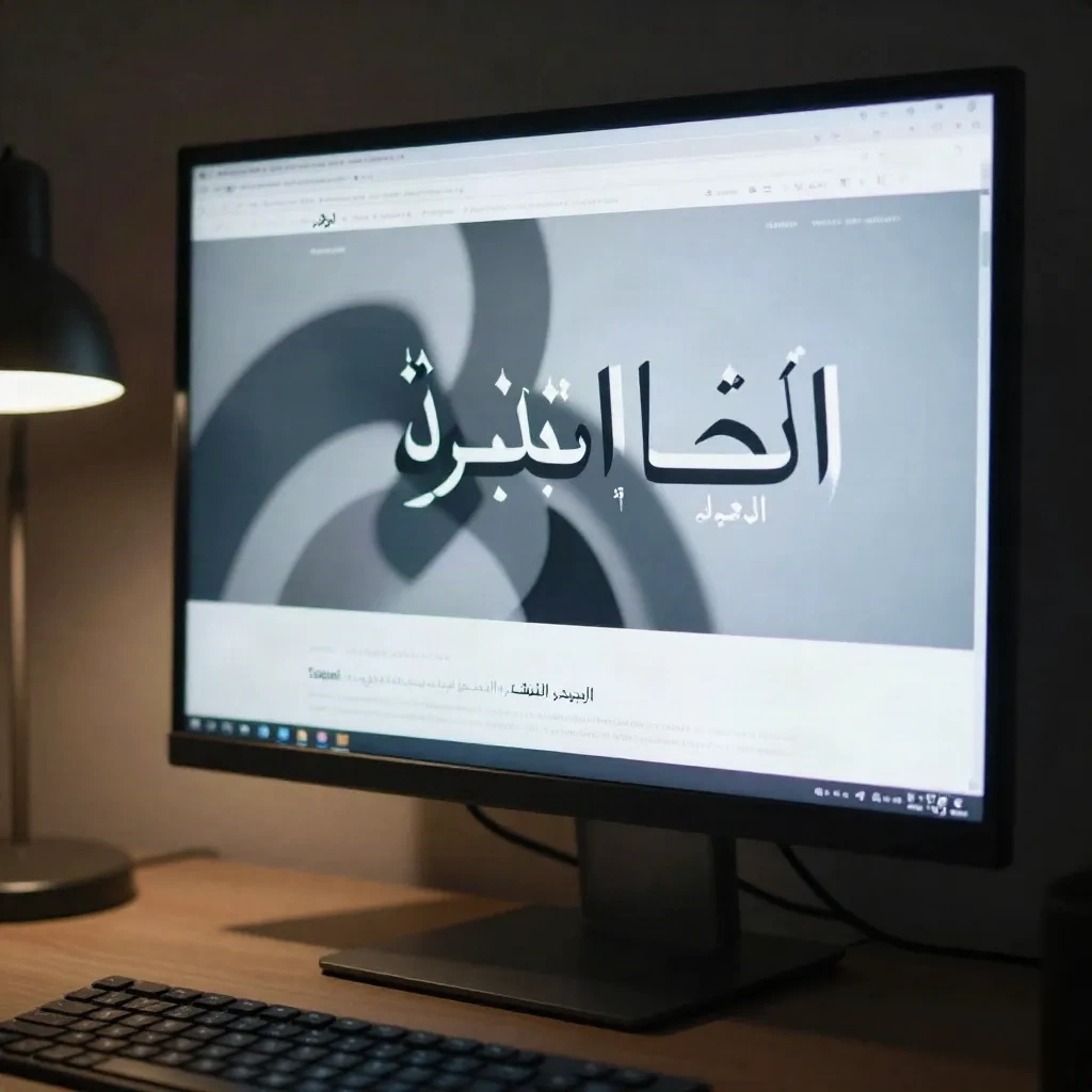
Our rule on bilingual MENA projects: generate the structure once in the primary language, then build the mirrored version from logical properties in the theme, not from a second prompt. Asking a model to redo the page "in Arabic" produces a different page, with different spacing and different bugs.
What is a sane workflow for AI web design on a client project?
This is the sequence we would use on a real engagement. It assumes you already work with a block theme.
Step one: write the brief as constraints. Audience, tone, the three sections that must exist, the brand tokens already in theme.json. A prompt with constraints returns something you can compare. A prompt with adjectives returns a mood board.
Step two: generate structure, not pixels. Ask for section order and content hierarchy first. Approve the skeleton before anyone looks at colour.
Step three: translate into native blocks. Build the approved structure with core blocks, Query Loop where content is dynamic, and patterns for anything repeated. Pattern Forge on noonwp is made for exactly this step: a described section becomes a registered block pattern that reads your tokens.
If the client needs a shop rather than a brochure site, decide that early. A WooCommerce build and a hosted shop such as WiziShop pull the design in different directions, and AI will not make that choice for you.
Step four: audit before handoff. Contrast, heading outline, keyboard order, image weight, and a real-content test with the longest title the client will ever write.
Step five: keep a human sign-off. The client pays for judgement. A model can propose and a practitioner decides.
How specific should the prompt be?
More specific than feels natural, and in a particular order. A prompt that opens with the visual mood ("modern, clean, bold") gets generic output because those words describe every site ever made. A prompt that opens with the reader's task gets structure.
A pattern that works for us:
Who lands on this page, and what are they trying to finish in under a minute.
The single action the page exists to produce.
The sections required, in order, with a word budget for each.
The tokens that are fixed: the type scale, the palette names, the spacing steps.
What must not appear, such as stock-photo hero banners or three-column icon grids.
That last item matters more than it looks. Models drift toward the average of the web, and the average of the web is a hero, three icons and a testimonial carousel. Telling the tool what to avoid is the quickest way to get something that does not look like everyone else's.
Keep each prompt short enough to read in one breath. When a draft misses, change one constraint and regenerate, rather than piling on corrections. Five stacked corrections produce a page where each instruction fights the others, and you lose the ability to tell which change helped.
What should you check before the client sees it?
A short list, run in the same order every time, because consistency beats thoroughness you skip when tired. Open the page at 360 pixels wide and look for overflow. Tab through the whole page and confirm the focus ring is visible everywhere. Swap the placeholder headline for the longest real one. Switch the site language if it is bilingual. Then run the page through a speed audit, since generated imagery is often several times heavier than it needs to be.
Do this on a staging copy with the client's real fonts loaded. A page that passes with the fallback font can still break the moment the final typeface arrives.
Should you use AI web design on every project?
Worth it when the budget is small, the structure is conventional and the client mainly needs speed: a local business site, an event page, a first prototype for a pitch.
Skip it when the site depends on a distinctive identity, on strict accessibility commitments, or on RTL layouts that must feel native. In those cases the correction pass costs more than designing by hand, and the generated draft anchors everyone to a mediocre starting point.
The middle ground is honest and unglamorous: use AI to widen the early options and to take over repetitive production, and keep structure, tokens and accessibility in human hands. That is a smaller promise than the vendors make. It is also the one that survives the client's first change request.
Pick one live project this week, generate only the skeleton, and build the rest in blocks. Measure the hours honestly, then decide what stays in your workflow.